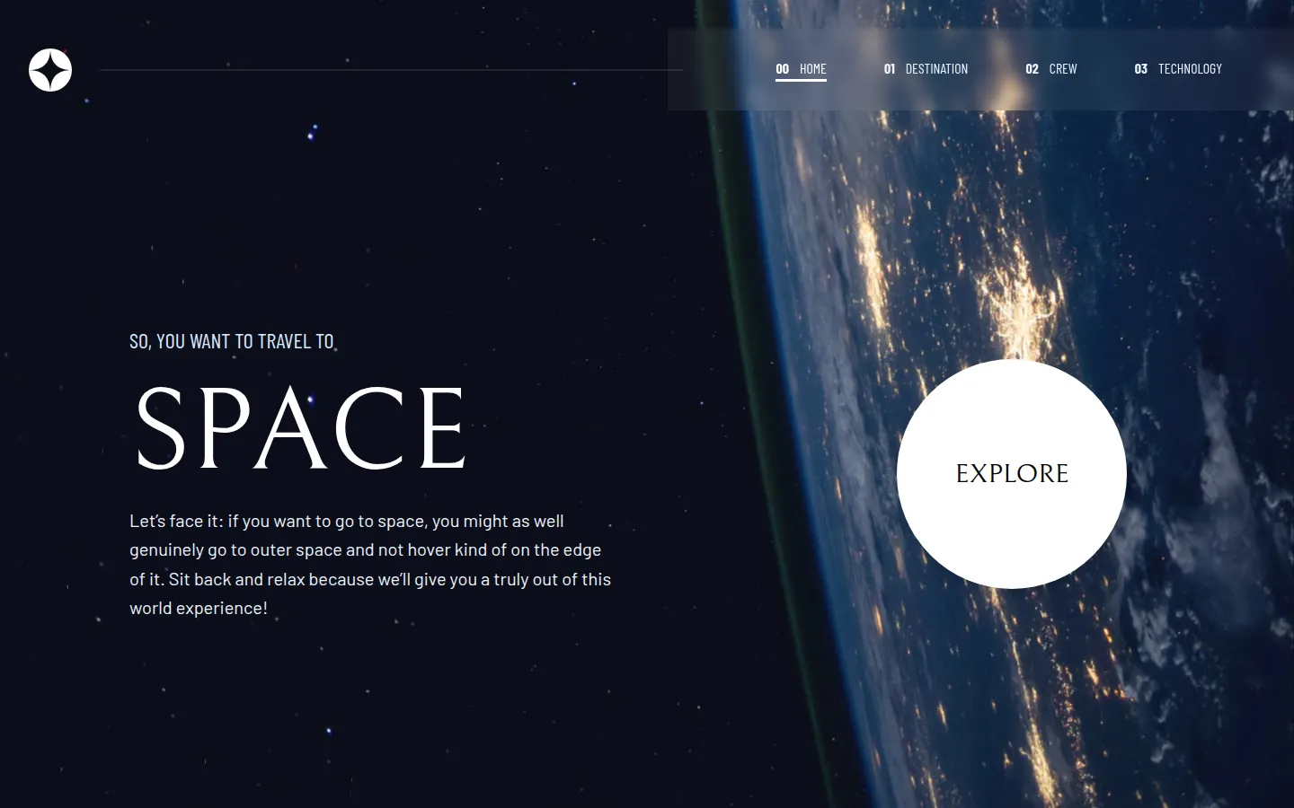
Space Tourism Website
2025 · Frontend implementation
A four-section site I used to practise layout systems and page transitions. Same shell, four content types, no page that looks bolted on.
What it does
- Four content types sharing one navigation shell
- A spacing and type system reused across every page
- Transitions between pages instead of hard cuts
What was hard
Four sections, four background photographs, each in a mobile, a tablet and a desktop crop. Rather than repeat twelve background rules across the pages, one component maps each route to its three crops, and each section's layout only says which route it is.
The mobile menu had to animate closed as well as open. A component that has been removed can't play an exit animation, so the menu sits inside Framer Motion's AnimatePresence, which keeps it mounted until the closing animation has finished.
Destination, Crew and Technology each switch their content with tabs driven by one selected index, so the tab, the picture and the text can't fall out of step.
Architecture
Frontend only: no server, no database, no sign-in. The section stays here because the next build has all three.